How do you show that someone or something is on the move?
One of the clearest ways of doing this is with lines. From one point to another, from a beginning to an end: even the words we use to describe mobility invoke ideas of linearity. Take, for example, this image depicting the numbers of people moving from one region of the world to another. This circular plot shows all global bilateral migration flows within and between the ten world regions from 2005-2010 in the 100,000s. It was developed by the Wittgenstein Centre for Demography and Global Human Capital and the Vienna Institute for Demography. Click on the red dots below to find out more:
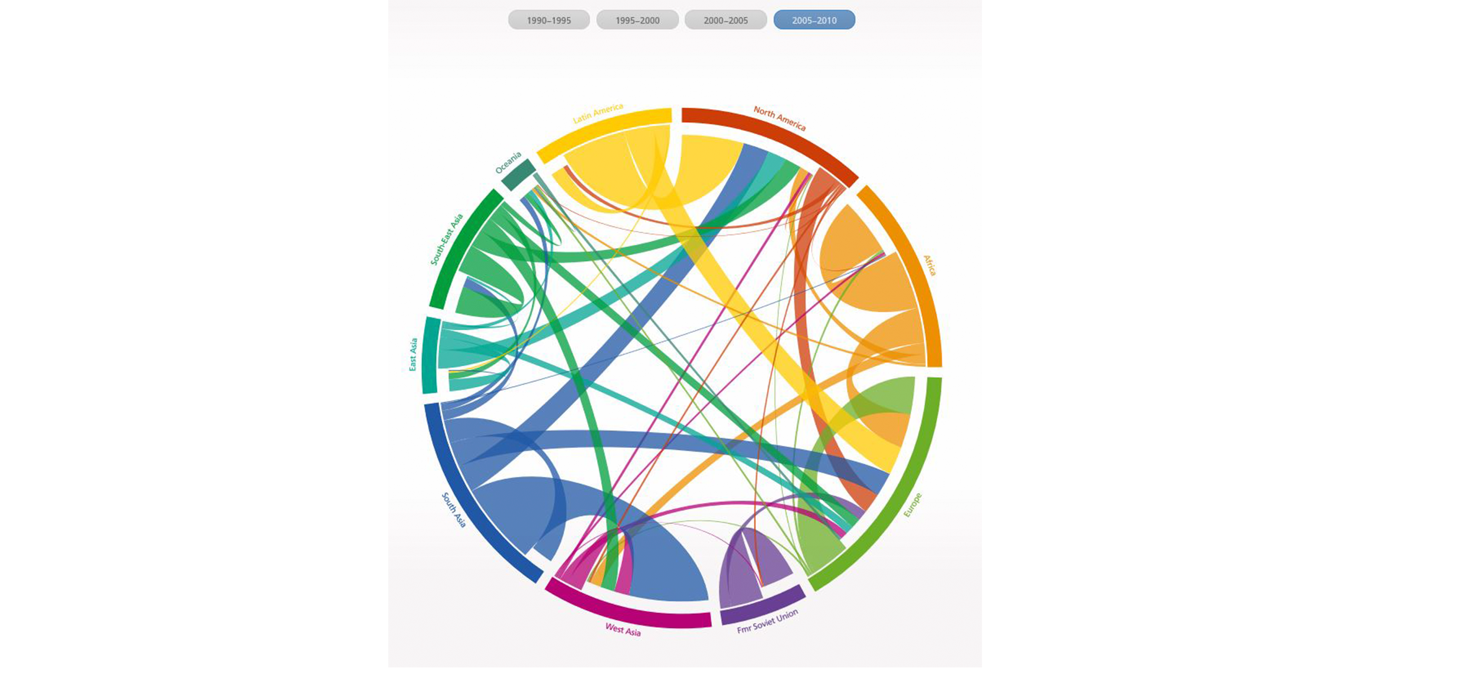
African migration mainly occurs within the continent, with the majority of African migration into Europe coming from North Africa.
Despite opening up economically to the rest of the world, the former Soviet Union still has a relatively 'closed' migration system.
Latin American migration is focused on North America and Europe.
[Global Flow of People, 2005-2010. Image used under Attribution-NonCommercial Creative Commons License and the kind permission of Dr. Nikola Sander, Research Director for Migration & Mobility at the German Federal Institute for Population Research.]
This diagram is very informative and attractive, but representations like these can shape how we think about movement in the first place: might these graceful, smooth arcs suggest that people’s journeys are similarly straightforward?
We often draw straight, unbroken lines on maps out of convenience or convention rather than correctness. And in some cases, where we aren’t trying to achieve pinpoint accuracy, that’s perfectly fine. But in reality, the universe and humans’ experiences within it often challenge – even defy – linear assumptions: our world is characterised by complexity. When we try to represent that complexity visually, it sometimes opens up new questions and leads to new answers.
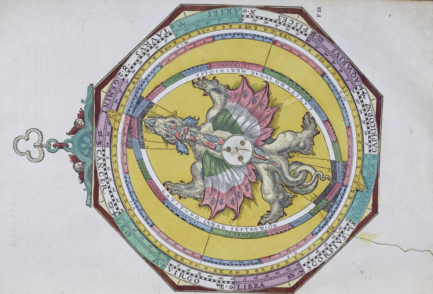
Here, you can see a table from the Astronomicum Caesareum, an early modern book of star charts. The table includes a number of cells used to predict astronomical phenomena. Although we can now predict the movement of the planets with pinpoint accuracy, in the Early Modern period this was far from true. Mars, for example, sedately crosses the sky, but every two years it zigs and zags, and even loops around in what would have been a bewildering way for these early astronomers. We now know those cycles are due to the planets’ elliptical orbits around the sun – Earth catches up to Mars and passes it.
[Astronomicum Caesareum, Peter Apian, 1540 (Arch.C.I.5.8, folio FIIv). Copyright: Magdalen College Library]
To make a prediction using this book, the charts would be used in conjunction with intricate volvelles – or movable illustrations. This beautiful volume is a true treasure of Magdalen’s Old Library. In the video below, William Shire, Assistant Librarian at Magdalen College, delves into its fascinating history:
What is more, we can move through time as well as physical space in similarly complex ways. Just think about any film or story involving time travel: while popular imagination extends beyond what is scientifically possible, the point is that journeys are rarely fully captured by simple lines, or expressed through movement that always goes forward. Indeed, part of the thrill of these stories actually comes from how they disrupt our normal sense of expected movement. Artists and musicians often play with this feature.
Sets of variations like John Dowland’s Lachrimae, for example, explicitly play with audiences’ expectations by letting a returning melody follow a different path in each variation. This process of discovery was one for the audience as well as for the performers. As you can see in the image below, the different voices in the print are not vertically aligned in full scores as we do today. As was common in the Renaissance, every single voice had its own linear path written out and only by performing the piece could one hear in what surprising ways these musical lines combined. The different orientation of the separate voices on the page also shows that performers were situated around the score, performing to each other more so than directly at their audiences – an intimate practice especially appropriate to these musings on “true tears”.
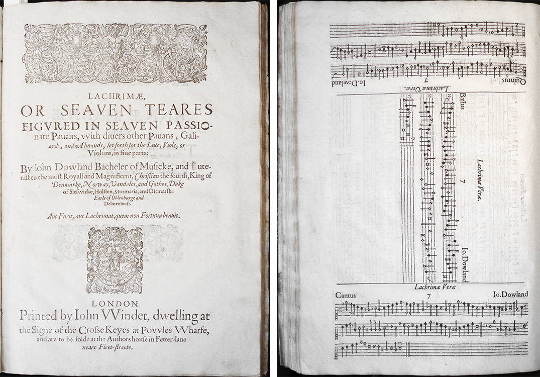
Lachrimae, John Dowland, 1604 (Arch.D.4.29(4), title-page and music). Copyright: Laura Ashby for Magdalen College Library, 2016.
Lines simplify, but they also can obscure. Our experiences of moving through life – whether at a very personal level, or at a universal scale – often involve other kinds of patterns: cycles, pauses, interruptions, memories that take us back to a certain place or time. Can we think of new ways of depicting that reality?